Interactive dashboards
Dashboards are essential tools for monitoring and communicating information, offering an at-a-glance understanding of complex data streams. In the context of a weather-forecasting application, a dashboard transforms raw meteorological inputs—temperature, humidity, wind, pressure, visibility, and UV levels—into clear, visual summaries. Its primary purpose is monitoring: users can instantly assess current conditions and detect changes or anomalies over time. At the same time, the dashboard’s layout and visual design serve to convey information intuitively, helping users interpret trends and forecasts without technical background. By integrating interactive elements such as maps, icons, and time-based charts, the weather dashboard allows exploration of both real-time data and predictive models. Even standard dashboards benefit from tailor-made visualizations that highlight the information most relevant to their audience—ensuring the display is not only accurate but also meaningful to the specific users it serves. Well-designed dashboards thus balance clarity and depth, supporting both situational awareness and decision-making, whether for everyday planning or for professional meteorological analysis.
Check out the examples below. If you’re curious how I work and what I deliver, the FAQs explains it.
Interactive dashboard of the Personal Weather Station, showing multiple resolutions of weather forecast: current, 8days daily-forecast, and 48h hourly-forecast. This view resembles the traditional weather app layout, with location selection, and the forecast information.
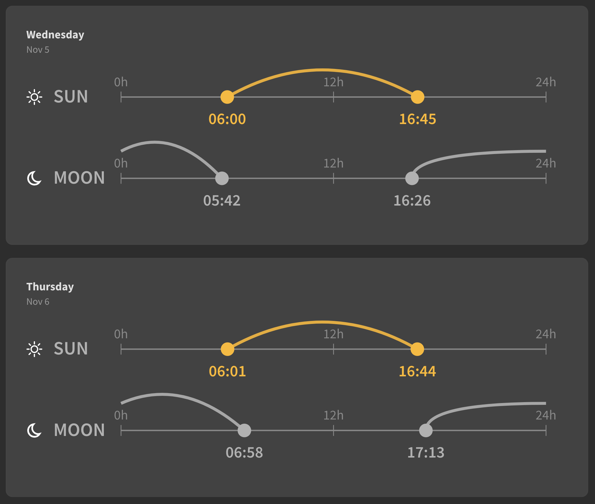
This visualization clearly depicts sunrise, sunset, moonrise, and moonset times through smooth arcs aligned to a 24-hour scale. For runners, it offers an immediate sense of daylight and twilight duration—helping plan early-morning or evening runs for optimal visibility and comfort. Its concise design supports quick, intuitive decisions about safe and enjoyable training times without needing to interpret detailed tables or forecasts.
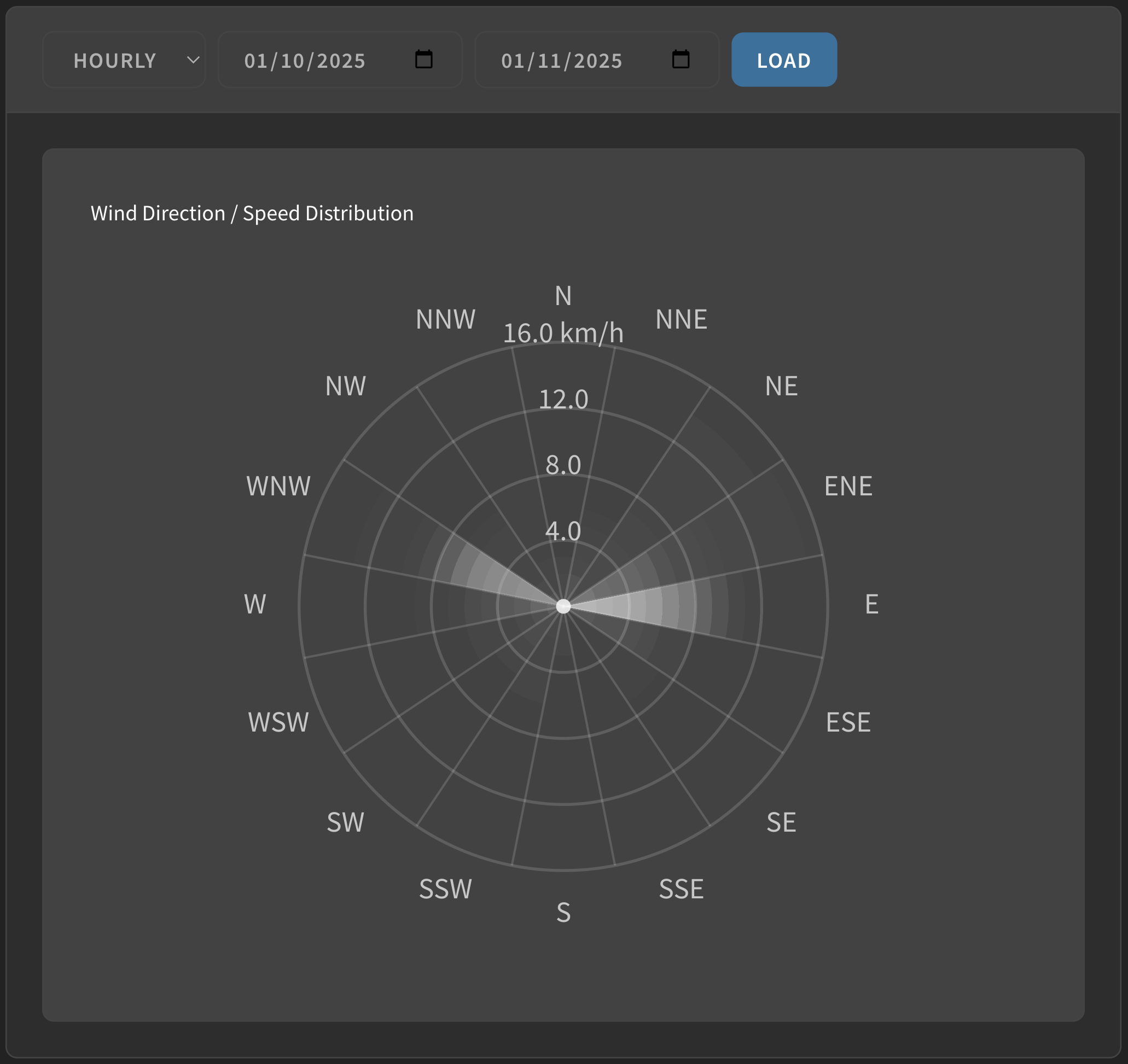
This visualization uses a wind rose layout, where direction radiates from the center (N, NE, E, etc.) and concentric rings represent increasing wind speed.
Each shaded wedge shows how often and how strongly the wind blows from a given direction—longer, darker segments indicate stronger or more frequent winds.
For anyone affected by wind—runners, sailors, or cyclists—it provides an immediate understanding of dominant wind patterns, helping plan routes, anticipate resistance, or align activities with favorable conditions.